» Green » Pistachio color: combination and selection of wardrobe
Pistachio color is a delicate, youthful shade of green that creates soft and contrasting combinations. Tables, selection of clothes. Photo
The pistachio tree is called the “tree of life” for its many beneficial properties, and its fruits are hard-shelled nuts with a delicate light green color – “lucky nuts”. In Persia, pistachios are considered a symbol of wealth. They are valued and grown in Greece, Syria, Iran, Spain, Italy, USA, Turkey and other countries. People conveyed their respect and joy for this delicacy to a color they called “pistachio” - a soft, light, elegant tone of green - subtle and refined, shades of which range from warm to cold menthol, they can be brighter or muted, like the pistachio itself , shimmering in halftones.
Like a delicate green, pistachio is the spring color of growth, multiplication, fertility, prosperity, tranquility and self-confidence. Like a light tone, that is, with a large admixture of white - feminine, immaculate, noble. Pistachio shades have long been included in the decoration palettes of the nobility, both in the wardrobe and in the interior.
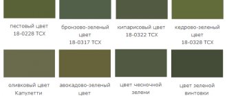
Shades of pistachio color. Photo
Like the nut kernel itself, pistachio color has many shades, from clear and bright to medium smoky, from warm to cold.
Medium pistachio is a clean and expressive light green with a spring flavor. It is the most saturated in this range and has a yellow-green base. Light pistachio is a pale shade of pistachio, characterized by lightness, freshness and purity. Along with rich pistachio, it is the most common. Yellow-pistachio - can be classified as dusty light olive. It has a golden color to it. It is distinguished by softness and sophistication. Beige-pistachio - tends to light khaki. Pleasant, natural tone, endowed with deep calm. Green-pistachio is a cool shade that is also present in this wonderful nut. In terms of lightness and saturation, it is equal to warm pistachio. All intermediate tones between warm and cold of the same lightness will also belong to the described range. Dark pistachio - from the pastel range - it is the darkest, but if considered in isolation, it will be closer to medium. The tone is cloudy, natural, soft, it can be classified as light khaki.
What shades does it go with?
Many other tones and shades go well with this color. Pistachio is universal, as it is perfect for young girls, emphasizing their youth, and for middle-aged women, refreshing their appearance.
Sobchak told who Prusikin was dating: how Tatarka reacted to this
Rospotrebnadzor called the situation with coronavirus in the Russian Federation one of the best in the world
Natalya Bochkareva told what she thinks about plastic surgery
Pastel colors pair well with other soft shades, while bright and concentrated colors look great with rich tones. A well-chosen combination will allow you to get a successful image.
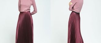
Pistachio color combination
The medium pistachio shade in combination can form romantic pastel pairs, but combinations with bright tones are also available to it.
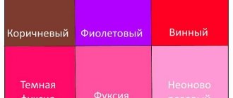
Let's look at the complex combination of pistachio:
- with pearlescent pink (2) - a light, romantic, pastel combination based on a light thermal contrast. This is a natural contrast that has long attracted our eye; it relaxes and pleases.
- with milk (3) - as with a neutral shade, forming a fresh combination with a predominance of pistachio. Soft, complex white mutes the contrast and acts as a highlight. You can complement the combination with pale sunny, honey-gold, coral.
Color combination: pistachio
How to combine different colors with pistachio? The basic rule would be to keep the purity of the pair in the same range as the soft green color. To enhance the contrast of the pair, choose dark, medium-saturated tones. Combinations with warm shades will be cheerful, while combinations with cold ones will result in more strict palettes. Light neutral shades will add style and consistency. There are 10 palettes with different shades for you.
A combination of pistachio and pink. For soft green, it is preferable to choose warm tones of pink; the lighter they are, the more delicate the range. But you can increase the contrast of the pair with rich fuchsia or hot pink. The palette is made up of royal pink, pink-peach, summer pink, fuchsia, and raspberry.
How to combine pistachio with red? Such a pair is built on additional contrast: bright and unprincipled, however, the fact that pistachio is soft and light, the intrusiveness of the contrast is reduced to pleasant. The darker the red, the higher the light contrast and expressiveness of the couple as a whole. Consider a combination with watermelon, coral red, ruby, bright burgundy, wine.
Color combination: pistachio and orange. Like all shades of green, this color goes well with orange. A combination with a slight resonance in temperature generally tends to a warm palette. The brighter and darker the orange, the more expressive the couple. Combinations with peach, orange-coral, carrot, fiery, red-orange have been compiled for you.
Pistachio combines with yellow for a fresh summer combination. The range can be called pastel, since the shades suitable for it are light, light, sunny, without a red undertone, but you can take cool color options. The palette includes pale yellow, lemon yellow, banana, yellow gold.
Pistachio and warm green combine as colors that belong to the same color scheme. Almost any middle expression of this palette is suitable in pairs, creating a feeling of depth and volume. The rich pistachio itself acts as a highlight. Consider combinations with chartreuse, olive green, swamp, greenery, dark green.
The combination of pistachio and cold green does not form a deep thermal contrast, while still being within the same tone, therefore, as in the previous version, they create volume and a feeling of light and shadow. Such a fresh combination can be either independent or a background for warmer shades. For example, a composition with the color of water, menthol, mint, emerald, malachite.
Pistachio and blue (blue): color combination. This is a refreshing pair with not a deep thermal contrast, but a pronounced light contrast in the case of dark shades of blue. Blue tones form a pastel range: light, gentle, summer. Check out pairs with the color of blue water, sky blue, blue-green, Prussian blue, sapphire.
The combination of pistachio and purple is spectacular and calm. Dark tones with a preponderance of red, such as plum and eggplant, are interesting. They create a slight thermal contrast and bright light, and overall they look harmonious and attractive. For example, consider a tandem with white-lilac, lilac, blackberry, grape, plum.
Color combination: pistachio and brown. Such a pair is natural, since we can easily see it in nature. Brown favorably sets off pistachio, filling the combination with warmth and light contrast. The boundaries of this pair are clear, so they can highlight the shape. The palette consists of beige-brown, yellow-brown, golden chestnut, chocolate, dark chocolate.
Pistachio color goes well with white, beige, gray, black. Although medium pistachio is a soft, natural, not prominent shade, it may well be dominant next to a neutral palette.
Almost airy next to white, soft, feminine - with beige, glossy - with gray, expressive - with black. Consider pairings with creamy, papyrus, beige, gray, and wet asphalt.
About pistachio color
To understand what pistachio color is, you need to know how different shades and color combinations are obtained. Using knowledge of the principles of coloristics (the science of color), you can determine who is suitable for a particular color. However, first you need to have an understanding of the basic concepts of color science.
Experts include the following color rules:
- Color tone. This is the visible color of the spectrum.
- Purity of color (chromaticity). This is the complete absence of impurities of white, black and gray shades in color.
- Saturation (intensity) of color. Directly depends on the amount of gray tint.
- Brightness. Depends on the presence and amount of white (more is brighter).
There are primary, secondary and tertiary colors. Primary colors cannot be obtained by mixing others.
These include:
- red;
- blue;
- yellow.
Secondary colors are obtained by mixing primary colors in different proportions.
These include:
- green (mix of yellow and blue);
- purple (when mixing blue and red);
- orange (red and yellow).
The proportion of mixed primary colors produces different shades of secondary colors. Tertiary colors are obtained by mixing primary and secondary colors. There are a huge number of them.
For example:
- pistachio (a collaboration of green and yellow; the shade changes depending on the proportion of colors combined);
- purple (mix of red and violet);
- cyan (blue with a lot of white/brightness);
- peach (yellow mixed with orange).
Light pistachio color and its combination
Light pistachio - feminine, light, very light shade of green with a slight predominance of yellow looks gentle and fresh. This is an ideal tone for a teenage girl: it will emphasize the freshness of the skin, and its combination can enhance the contrast of appearance. In a romantic wardrobe, light pistachio will be more appropriate than in any other. The relaxing effect of the tone can be used in home clothes or underwear, as well as for relaxation. It's just as good for prom.
Combine light pistachio with shrimp, fuchsia, red rose, mango, red-orange, lemon, gold, mint, leaf green, dove, royal blue, lilac-amethyst, blackberry, bronze, latte, wet asphalt.
Tell me what is best to wear with a pistachio dress
Hi all! I’m going to a friend’s wedding and I have a satin sheath dress in pistachio (pastel green) color, also called “apple green” color. I have black suede shoes and pastel dirty pink sandals. I don’t know what to wear (the weather is predicted to be +10 in the morning and evening, and +22 in the afternoon. I’m wondering whether I should wear tights or not. Girls, please tell me))) and what color is better for a handbag (there are black, pink and white).
if from what you have, then it’s better to have everything in black, and if you can buy it, then it’s better to have nude beige shoes and a handbag
dirty pink will probably go with pistachio. In general, try it all on.. and if you want advice, then also take a photo and show it here
The whole range of lilac-violet tones will be simply super for pistachio
New features and design have appeared for the version of the Woman.ru Forum on computers. Tell us, what are your impressions of the changes?
Beige and coral looks cool. I think black would be a bit rude.
I would wear nude shoes that are so trendy. The thinnest tights. Bag - silver clutch (lilac). Both pistachio and apple are completely different colors, author. Apple is brighter and richer, pistachio is paler, you decide.
black ones can go if there are some other black beads
I would wear nude shoes that are so trendy. The thinnest tights. Bag - silver clutch (lilac). Both pistachio and apple are completely different colors, author. Apple is brighter and richer, pistachio is paler, you decide.
Let me clarify: I have more of an apple color (as in American films) than pistachio and it’s very, very delicate.
Probably good for this color, only silver/gold/yellowish. obviously not black((
Better buy light shoes and take a light bag.
white or beige shoes and bag
Black shoes won't go well with a pistachio dress! There was also a black leather bag missing. Better light shoes! I have a dress this color, I wear it with red shoes.
if you choose from yours, then pink sandals and a bag, although you should see the shades.. if you have the opportunity to buy white shoes, then you can take a white bag. black is undesirable..
Service for purchasing goods in Europe https://evro-shopping.com
The user of the Woman.ru website understands and accepts that he is fully responsible for all materials partially or fully published using the Woman.ru service. The user of the Woman.ru website guarantees that the placement of materials submitted by him does not violate the rights of third parties (including, but not limited to copyrights), and does not damage their honor and dignity.
The user of the Woman.ru site, by sending materials, is thereby interested in their publication on the site and expresses his consent to their further use by the owners of the Woman.ru site. All materials on the Woman.ru website, regardless of the form and date of publication on the site, can only be used with the consent of the site owners.
Yellow-pistachio color and its combination
Pistachio yellow is a soft, muted tone filled with positive and relaxing properties. It looks good in urban style, leisure wear and everyday wardrobe. Suitable even for an office set of things, but for business meetings it is too friendly: its relaxing atmosphere is not conducive to decision-making, and the image of an open and sympathetic person is more suitable for a family circle. Although the tone leans toward summer, all-season use is possible.
When choosing a yellow-pistachio pair, consider shades such as strawberry, dark pink, dark red, coral orange, copper, mustard, old gold, khaki, malachite, thrush egg color, thunderstorm, purple, red-violet, mahogany, milky, anthracite.
Tell your girlfriends
Support the Womee project, because we put our whole soul into it - share the article with your friends by clicking on one of the buttons below
Pistachio color is a type of shade belonging to the green color palette. This color is bright, life-affirming, fresh and positive. It will add tenderness to the image, and its owner will be transformed and filled with vital energy and strength.
Beige-pistachio color and its combination
Beige-pistachio is a muted, light green with a positive yellow undertone. His desire for a neutral palette makes the tone universal; it also gives an advantage in creating combinations: both rich and muted tones will look chic next to it. However, it is worth remembering that the level of color purity must be consistent. The color is all-season, looks good in both everyday and evening wardrobes. It has a relaxing effect and creates the image of a calm, confident woman.
To combine with beige-pistachio, you can choose sakura, purple-pink, red-terracotta, orange-coral, brick, champagne, old gold, patina, brown-green, steel, dark blue-green, gray-violet, grape, chocolate, light beige, wet asphalt.
The magic of mixing paint colors
The color gets its name from the nuts, whose shells are cracked to reveal a pleasant green color. The palette varies from brown-green, slightly withered to a joyful light color. It is worth understanding what shade you need to get in the interior. In any case, certain colors of paint will be required, and the question of how to get a pistachio color will be solved in practice.
The palette ranges from brown-green, slightly withered to a joyful light color!
What is needed for work:
- color sample (interior photo, piece of wallpaper, illustration);
- paints: blue-green, yellow (ochre, terracotta);
- brush; paper;
- palette for mixing paints;
- glass of water.
Secure the sample in the middle of the Whatman paper. Start mixing paints. Gradually adding color, carefully mix until smooth and paint near the sample. By varying the amount of one color or another, color saturation, texture density, strive for a perfect match with the selected sample. Write down the proportions of mixed paints; to paint the walls you need to know the exact dosage of each color. Enjoy the process, because the walls in your house will be painted in your favorite shade. Make several samples from light pastel to dark rich colors.
If the speed of getting what you want is more important to you, then visit a hardware store. In the paint and varnish department, you will be offered pigments, mixing them with the base color to create the desired pistachio color for walls or other surfaces. With this approach, you can vary the intensity, density, and compatibility with other shades.
The easiest selection option is to purchase ready-made, graded paint in the required volume. You should choose a shade according to the ral palette. By examining the proposed palette, it is easy to understand what saturation and density of shade you need for your interior, and choose color combinations in the design of the room. Take a closer look at catalogs that contain photos of interiors using the selected palette.
The easiest selection option is to purchase ready-made, graded paint in the required volume!
Green-pistachio color and its combination
Pistachio green is a fresh, charming shade, characterized by freshness and innocence. The good thing about the tone is that it creates amazing pairs based on warm-cold contrast, which can increase the contrast of appearance, refresh the skin, and highlight the tan. The color is more of a summer color and looks good in a romantic style, home wear, or leisure wardrobe. Will be attractive in an evening look. As a cool shade, it can look strict, so it is also suitable for office style.
Combine pistachio green with cloud pink, coral pink, Chinese red, mango, carrot, fawn, pale gold, kelly, dark green, thrush egg, blue grey, thistle, purple, umber, cream, black.
"Kitchen"
How do shades affect our appetite? Scientists have found a rather encouraging relationship - they do not excite, but also do not suppress as much as the same blue color. Pistachio also has a property that is useful for all of us - in the morning it acts on us like a good dose of caffeine, shaking off the remnants of sleep and instantly returning us to our tone. Does the thought of drinking a glass of green juice in the morning terrify you? Paint the walls pistachio and expect positive changes!
"Pistachio + beige"
- Pistachio is universal in the kitchen - it will fit into both retro and high-tech style. Please note that it is combined with both classic furniture and metal parts with a glossy shine. In a modern kitchen, you can decorate it with an apron over the stove or a cabinet panel; in a vintage kitchen, you can choose all the furniture in this color, as in the photo below.
"Pistachio + black"
- A bolder and more aggressive option is to combine pistachio with piercing black. It will be interesting if the latter has a barely noticeable texture - for example, if you choose marble or granite tiles.
Dark pistachio color and its combination
Dark pistachio is reminiscent of a light olive tone - subtle, feminine, which is more suitable for mature women. Having a medium saturation, the shade is more suitable for a medium-contrast appearance. It reveals itself wonderfully in a feminine wardrobe, successfully combining with warm, neutral colors, beige, cream, and brown. Suitable for both office and evening wear.
Dark pistachio is combined with peach-pink, amaranth, tomato, golden-copper, red, sand, bright gold, brown-green, malachite, dark turquoise, dark blue, orchids, eggplant, dark chocolate, latte, black.
Pistachio color in clothes
Pistachio color in clothes is a romantic, fresh and soft tone; it can be used for the wardrobe of an adult woman, but still it is more teenage. It is completely unsuitable for creating a serious image, but can serve as an elegant element. The presence of this color in fashion is due to the attitude towards women; if the era sees women as not independent and fragile, homely, then pistachio will definitely appear in the collection.
“What do psychologists say?”
Pistachio color is an expression of healthy energy, without being too aggressive. His calm joy is useful for everyone - both for people who are in a normal state of mind and for those who are tired of life. In this regard, it is difficult to overdo it with pistachio. Subconsciously, we perceive it as one of the most comfortable shades for the eyes.
All shades of green are known fighters against negative energy. But if the cold tones of greenery seem uncomfortable to many, then this will not happen with pistachio. The yellow and brown undertones are visible quite clearly, making the shade seem saturated with the sun's rays.
Who would suit pistachio color in clothes?
When choosing this tone, you must be sure that it suits you, since its pale shades mute the high contrast of appearance. So for the “spring” and “winter” color types, the main choice will be clean, bright colors, such as rich pistachio, light pistachio. A combination of bright and dark colors will help you enhance the contrast. For “summer”, muted shades are suitable, such as light pistachio, yellow-pistachio, beige-pistachio, green-pistachio, dark pistachio. Representatives of the “autumn” color type will also be able to use soft, hazy shades, bypassing bright and clean ones.
What does it look like
The pistachio color gets its name from its similarity to the shades of the internal contents of the fruits (nuts) of the tropical pistachio plant. Its shades belong to the green color scheme and are obtained by mixing with yellow colors of different shades, in different proportions and nuances.
In addition, pistachio can contain white in different quantities (then it is brighter and lighter), nuances of gray (more subdued and calm), and blue (darker). The shade of pistachio (pistachio) color depends on the nuances of green in its composition. It can be very light (from white-green) and very dark (to green-brown).
The combination of pistachio color in clothes
The combination of pistachio color in clothes can be divided into two types: pastel and contrasting. Pastels include combinations where two shades differ little in lightness, but differ in tone. The darker and brighter the tone, the more expressive the combination with it.
Black and pistachio color is a bright combination that highlights the borders as much as possible, so the shape and various patterns will be most beneficial in this color scheme. White is often added to this combination.
White and pistachio – an airy, delicate combination, fresh, summery, youthful. A floral print with pink or yellow splashes will go very well with it. You can add contrast while maintaining freshness by using other shades of green.
The gray-pistachio color depends on the lightness of the gray: light grays give the pistachio a feeling of gloss and well-groomedness. Medium and dark grays increase the pair's contrast. If you complement the combination with white, light beige, yellow, as well as gray of different shades, you can achieve a very interesting and sophisticated pair.
Beige and pistachio paired support a warm, summer mood. The lighter the beige, the sunnier the combination. Medium beige enhances the femininity of the couple and brings elegance. To enhance the contrast of the pair, additional shades of green or a floral print are added to the light pair; in addition to green, other shades of beige, possibly white or gray, are added to the middle pair.
Pistachio brown is a contrasting palette that maintains softness. Dark browns can be used as an alternative to black: it just as intensely emphasizes edges and shape, but the contrast is more subdued, warm, and natural. Light, rich brown tones come into mid-contrast and continue the romantic mood of the main color. The first combination option is complemented by not bright white, the second – by shades of green.
Yellow and pistachio combine into a clean, joyful, summer-spring pair. Yellows and pale yellows without an orange undertone are an ideal pair for light yellow-green with any degree of purity, but the similarity must be observed in both shades. You can increase the effectiveness of the pair using brown, darker green and black.
Orange-pistachio is a harmonious, warm, holistic combination that can be delicate, bright or natural. Coral creates a summer mood, especially if the tones are in a floral print. Bright orange requires the support of blue, black, dark green. Pale and muted oranges look natural and pleasant next to an equally hazy green, but next to pure ones, the combination must be complemented with gray and other pale tones.
Red-pistachio is a successful, bright combination that does not hurt the eyes, like the ultimate complementary pair. You can use both medium and bright tones, but, in my opinion, the combination with medium red with a pink undertone looks especially expressive. You can enhance the palette with black, white or brown.
Burgundy color in combination with the main color increases the contrast of the pair, adding severity and elegance. Brown would be very appropriate in this range.
Violet-pistachio can be either subtle or high-contrast. Purple and dark violet highlight the main color favorably, but for balance it is necessary to add white, gray, pink or dark gray-green to the pairs.
Pastel and medium lilac tones create a delicate and feminine flavor. White people can support him.
Pink-pistachio is one of the most pleasant and delicate combinations, especially if they are warm, soft pinks. This relaxing couple only belongs to the romantic style. For balance, beige is often added to it.
Bright fuchsia looks juicy and contrasting next to soft green, without requiring a balancing addition, but you can add elegance to it with the help of beige.
Blue-pistachio is a summer, cool combination, the brightness of which depends on the shade of blue. Soft blue tones: the colors of water or sky form a pastel palette that is relaxing and unobtrusive. It can be enhanced with darker blue or beige, but without going beyond the purity of the main pair. Bright turquoise is a more expressive and active option. A red accent in such a palette can be a nice highlight in contrast.
Blue-pistachio is a bright, cool combination, where the richer the shade of blue, the more catchy and impressive it looks. Gray-blues balance the naivety of soft green, focusing on its natural nature. Instead of bright dark blues can be used as an alternative to black, bringing not only the utmost contrast, but also freshness to the combination.
Pistachio and green , as colors of the same range, the most pleasant and recognizable to the eye, create voluminous, emotional palettes that can be either independent or a background for warm colors. Most often, for variety, basic tones such as white, beige, black, gray-blue are added to such compositions.
VIEW COMBINATIONS WITH SIMILAR SHADES (click on color)
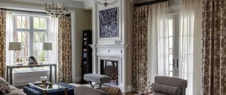
"Living room"
If the living room in your house is sunny and spacious, turn to pistachio without much thought. He can't tire anyone. And considering what a motley group gathers in the living room, this factor is worth paying attention to.
“Pistachio + light green”
- If the pistachio color is boring and seems gloomy, do not rush to make repairs. Perhaps a bright lime green detail will improve the situation! In the photo below you can clearly see how the partition matches the darker wall in the background, and together it looks great!
“Pistachio + shades of wood”
- Design projects in the island style, which can be imagined somewhere in a house in Haiti or Bali, work especially well with the participation of pistachio. They are dominated by simple wooden furniture, often wicker from plants, and simple decoration. But most importantly, in such rooms there is an atmosphere of remoteness from the big city and a feeling of harmony with nature. If you need to add bright spots, let them be accessories in terracotta, peach or dark orange.
“Pistachio + white + chocolate”
- Unconditional severity, but a sense of humor is not alien to her! Give the dark chocolate shade about twice as much space as the green one, and let the rest of the space be refreshing. We have selected a very good example for you - a pistachio-colored table and wardrobe, white wallpaper and sofas in the interior, one wall completely painted brown. Pay attention to the additional details of light green, which refresh the room and serve as support for green.
"Pistachio + gray"
- If you are a fan of less bright solutions, then we will tell you how to somewhat tame the brightness of pistachio. To do this, white should be replaced with light, and the image of the room will change dramatically. The yellowish component will be drowned out, and only deep, distant green will remain on the surface, as in the living room in the photo below.