The color aqua is often confused with turquoise. In reality, it is a darker shade of blue-green, with the blue being more pronounced. The color of the sea wave is a complex and deep shade, so it is quite demanding of the other colors of the sets.
Influence vector
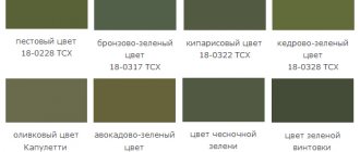
The multifaceted aqua color palette includes many shades at the intersection of rich blue and intense green. Petrol, teal, turquoise, ivy, spruce, Pacific and others. These deep tones are harmoniously combined with each other and other colors of the spectrum, therefore they provide real scope for the designer’s creativity.
Using the deep color of sea wave, an atmosphere of luxury and solemnity is created Source voginteriors.ru
Non-standard accessories with gilding fit well into the design concept, favorably emphasizing the main shades.
Marine spectrum source i.pinimg.com
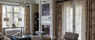
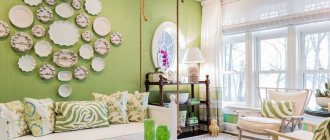
Using petrol color in living room design Source sneekweek.info
The walls are painted petrol Source www.istikbaldidim.com
Teal color combined with rust color Source i0.wp.com
Mystical combination: teal and slate Source www.initial.com.ua
Teal and dark brown Source img.superdom.ua
Easy combination: turquoise, white and light gray Source dekorationblog.com
When choosing a palette for the interior of a room, you should remember the power of influence of color and combinations of shades. With their help, you can fill a space with energy, relieve psycho-emotional stress, relax a person or cause a feeling of depression, provoke the development of depression. The color of the sea wave brings a feeling of freshness, cleanliness to the interior, and helps to cope with fatigue and irritation. Unlike blue, if blue-green shades are present in abundance, they do not cause melancholy.
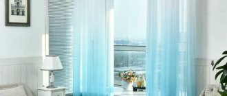
The color of aqua (aka cyan) sets you up for a restorative rest before a new start, calms you down and reduces stress Source landvilledrywall.com
Suitable style solutions for sea green color
These shades go best with:
- Mediterranean style.
- Provence, if only the blue is greatly diluted with white, that is, they form pastel colors.
- High-tech and boho - they prefer bright colors.
- Loft or pop art. Here it is better to add accents from sea-green furniture or decorative elements.
Marine palette in interiors of different styles
Marine colors are often present in interiors decorated in Mediterranean styles and are associated with the warm sea. Because it is so versatile, it can be incorporated into almost any style of interior as a sophisticated backdrop or accent. It will decorate a room decorated in both traditional and modern styles. The marine palette is used for paintings, curtains, furniture, surfaces, including floors and ceilings.
Living room in Mediterranean style Source arkadiaplus.com.ua
In this photo, the designer combined marine shades with white, gray, beige, sand and milky blue
Marine style kitchen Source bucwar.ru
Deep rich or delicate shades are used in the decoration of walls, furniture, and accessories. With the help of sea blue you can add originality to the classical style, to add nobility to the art deco style, and to give spectacularity to the Scandinavian style. By correctly placing color accents, you can add luxury, sophistication, and lyricism to your style. In high-tech, cool tones will emphasize the shine of metal, and in oriental styles they will make the celebration of colors more harmonious.
Office in a classic style. Colors create an atmosphere of peace and comfort Source st4.styapokupayu.ru
Neoclassical. Deep sea green color is less pompous than burgundy and red Source i.ytimg.com
The color scheme is perfect for creating an elegant formal interior
Pop art design Source stemcellglobal.info
Marine shades in a fusion style interior Source roomester.ru
Selecting harmonious tones
Let's look at a few shades from the light and dark palettes that it goes well with. In addition, you should pay attention to its brightness - it can be from pastel to saturated options.
- Soft light. Most often these are pastel shades. It is better to combine them with a rich tone, then in contrast they will give maximum harmony in clothing. These can be very light options, with a barely noticeable color, or more saturated, but not flashy. Pay attention to the blue and pink palette in this case, as well as white, gray, green and lilac. It's best to wear them on accessories and add-ons (like shoes or a jacket) and use our main shade as a base.
Soft dark. In this case, we are no longer talking about pastels, but still about delicate shades. The advantage of dark is that it can be taken both as a base and as an addition to the base. The best combinations here will be with blue and coffee colors.
- Saturated light and dark. Since these colors are bright and telling, they can be used as full-fledged additions to our base. In clothes, this combination will look quite extravagant and risky, but don’t be afraid to wear it! Take into account the combination of the following shades with the “sea wave”: burgundy and wine, raspberry, ocher, yellow and, of course, black!
Many people confuse "sea wave" and turquoise, while they are actually completely different. This is the difference: the first of them is closer to blue, often turns into blue and even casts gray.
But turquoise is between blue and green, usually casting one or the other. And they are confused because they belong to the same range.
What colors to choose for the interior
Blue-green shades form harmonious combinations with many representatives of the color palette, including classic, neutral, as well as bold and intense. Moreover, they go well with both cold and warm tones. Almost any combination of sea green with other colors can be organically used in the interior. The main thing in business is a creative approach. Creative thinking is cultivated through trial and error and observation.
Combinations of shades for interiors from professional designers Source avatars.mds.yandex.net
Catch the harmony of color. Nature offers the perfect composition Source i.vimeocdn.com
How to find the right solution Source animalworld.com.ua
Combinations with classic shades
A win-win combination is a combination of blue-green shades with neutral representatives of the color palette: gray, white, beige.
White reveals the beauty and depth of blue-green Source cdna.artstation.com
See also: Catalog of projects of houses for permanent residence in the Russian style.
How petrol and gray shades resonate in the interior Source www.mujerhoy.com
Beige complements sea green Source propertyshutters.com
Color map: cyan, bright wood, graphite and white Source st.hzcdn.com
The composition is based on natural colors Source www.bohemia-ivele-crystal.ru
Blue-green colors combined with wood, sand and brown create a cozy atmosphere at home.
A non-standard solution for a cozy nest Source modernplace.ru
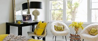
Combinations of marine shades with yellow, orange, pink, red, and crimson will help add life-affirming energy.
Bright accents are balanced by deep sea colors Source www.psdovidro.com.br
Dining room design with ship chandelier Source markdsikesblog.com
Bright red accents emphasize the charm of turquoise and add drive to the atmosphere Source img.benimmulku.com
Fuchsia pillows bring mood to the too calm atmosphere created by greys, browns and blues Source 1.bp.blogspot.com
Royal living room Source roomester.ru
With the help of a golden hue, you can give the interior a delightful luxury, pompous and at the same time noble.
Luxury and a sense of proportion Source www.luxuryfurnituremr.com
It is difficult to combine black with other colors in the interior. However, black accents have a hypnotic attraction, including the complex blue-green palette.
The bet is on black and deep blue-green Source www.inspirander.pl
See also: Catalog of companies that specialize in glazing and selling finishing materials.
As a companion color, you can use delicate silver, which does not draw attention to itself, but fits organically into the decor. Shades of sea green color can be successfully combined with each other.
Color combination rules
Every woman dreams of being stylish. But not many people know that the main thing in an image is the combination of colors. This is a whole science!
We are talking not only about the colors of clothes, but also shoes, as well as a selection of accessories.
A stylish look is 99% made up of the right combination of colors in clothes, makeup, and accessories. If the colors are combined incorrectly, it creates the feeling that something is “wrong” with the appearance. This is connected not so much with a conscious understanding of the fashionability and stylishness of things, but with the physical laws of color perception. — Julia Banich
Of course, color rules change from century to century, because fashion is fickle. Capricious clothing styles often do not allow more than 1-2 colors. And on the streets of the capital you can see quite colorful images. This is all personal preference.
Back in the fifties, the magazine "Advice for a Housewife" talked about forbidden color combinations. Red and yellow, green and orange, purple and yellow were banned. Combining these colors was a sign of lack of taste.
Today, correctly selected shades of different colors are beautiful and modern. In a woman's wardrobe
If you are a fashionable woman, or want to be the one who attracts attention, we have
1 look – maximum 3 colors
We took the six most common, fashionable and current colors. Let's consider them from the point of view of fashion, image and combination with other colors.
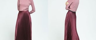
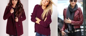
Burgundy and its shades – Marsala and cherry coffee.
Clothes of a rich burgundy color are not difficult to find in stores; it is now in trend. But not every girl or woman will wear it. This is the color of the brave, self-confident, daring. If you wear a burgundy item, then your image will definitely be accompanied by royal self-confidence.
Marsala, in simple words, is wine. Nowadays, accessories (bags, shoes) in marsala color are very popular. It is also often found on the nails of beautiful ladies.
Cherry coffee is the darkest shade of burgundy. He looks strict and noble. Close to black, but the redness of the burgundy tone is bright and energetic.
All shades of burgundy are combined with purple, dark blue, beige pink and nude, as well as with dull yellow and green palettes.
Pink can be bright, but we're interested in more pastel tones, soft pinks, beiges and pearlescent pinks.
Expert opinion
Romanova Ksenia Petrovna
Interior design expert and fabric store manager
When pink is close to the body color, it opens up new possibilities for imagination. If you want to attract your partner's eye, this shade of pink will be just the thing.
It's no secret that beige pink looks more flattering on tanned skin. This applies to both makeup and clothing.
Pink beige and nude pink are easy to combine with the same dull, pastel tones of lilac, green, purple and yellow.
Coral pink with mother-of-pearl is close to natural shades, but still it is paler and more delicate. This color will look equally good on white and dark skin. If you complement the image, for example, of a coral-colored dress with pearls, the image will turn out to be very light and mysterious.
You can combine it with yellow, but faded, shades, with blue-gray or white. Versatile, coral pink will look great with jeans, navy blue or dark brown.
Red and coral red.
It is known that the color red is a symbol of fire, passion, energy, provocation and power. A wardrobe with hints of red is a statement of confidence. Like red nails and lips or red shoes with impressive stiletto heels.
Bright red color in itself screams about your image, add other colorful colors to it. For the poet, it is best to combine classic red with white and black - this is the basis of the combination.
But this does not mean that you cannot create a decent look with soft beige and terracotta shades. Also, stylists recommend combining red with blue and purple.
Coral red, warm, cozy. It does not hurt the eyes and is suitable for any type of appearance. When strolling aimlessly through the shops, get yourself a coral red sweater or dress; a woman in red is a woman in trend.
You can wear something of this color at any time of the year and at any time of the day. Coral red color is used for both evening and everyday wear.
A good addition would be light shades of yellow and orange, as well as turquoise, lilac, and beige.
Turquoise, Atlantis, aquamarine, sea wave.
Turquoise is a very reverent color. It may be closer to blue, or it may be perceived as green. The green tint is determined by the colors “Atlantis” and “aquamarine”. And for blue - aqua and dark turquoise.
Aquamarine is a pale turquoise color. Very delicate, flowing, as if translucent. It is often used for silk and chiffon fabrics. Jewelry of bright colors will suit it: orange, green, pink stones, as well as gold and silver.
Expert opinion
Romanova Ksenia Petrovna
Interior design expert and fabric store manager
In turn, turquoise-green, also known as “Atlantis,” is more saturated and deep. He is independent and firm. One can say about a person who wears clothes of this color: nothing is impossible for her!
The aqua color evokes romantic thoughts of vacation and relaxation. But recently it is often used in office clothing and accessories. By the way, it is universal, despite its brightness. It can be safely combined with white and black.
Dark turquoise resembles a sea wave, but it is colder and more cautious. This shade does not draw attention to itself, but it looks unusual. It is easy to choose jewelry and accessories for it.
Turquoise green and turquoise blue look great with orange, royal blue, rich green, red, purple and pastel shades of yellow.
Blue color is often associated with the sky, lightness, and freedom. A woman in a blue dress or coat looks beautiful and at ease. Blue shirts and blouses, tunics, go well with dark colors of skirts and trousers.
The calmness and harmony of blue in jeans makes it universal. And blue accessories and shoes will be a highlight, even for the most discreet look.
Blue is combined with white, soft pink, pastel yellow, lilac and dark shades of purple, blue, brown and green.
Dark blue and royal blue, or blueberry color.
Cool blue colors require bright additions. Accessories, makeup, accents. Flowing fabrics of scarves, straps, jewelry with rich stones are the constant companions of royal blue.
Blue color is universal for all ages and body types. A big plus of blue shades is that they slim and emphasize the contrast of skin and hair. Royal blue and blueberry blue always look expensive in clothing and accessories.
Paired with vibrant shades of blue, green, yellow and pink, you will definitely turn heads. The combination with white and burgundy is more classic and noble.
In conclusion, we would like to remind you, beautiful ladies, that gold, bronze and silver colors are always in trend. They are easy to combine with any shades, any colors. In addition, metallic shades transcend the seasons and clothing styles.
Be bright, be stylish, be happy!
Photo wallpaper
With the help of designer wallpaper, you can create a non-standard atmosphere: bring dynamism, the energy of the sea element, or the tranquility of forest harmony. A powerful wave will carry away negative emotions, clear water in the reflections of the rays of the setting sun will calm you down and give you a feeling of self-confidence. The living room and bedroom in sea green color using photo wallpaper will allow you to enjoy the stunning seascape landscapes every day. An image of the ocean, sea, corals or waves will visually expand the space.
Motifs of blue-green colors Source ae01.alicdn.com
Sea element in the living room. Dynamic notes in the interior Source shop7239.hstatic.dk
Marinist landscapes in bedroom design Source storge.pic2.me
Photo wallpaper with a wave and foam scallops creates the impression of realism of the depicted elements Source www.xdecor.cz
The wave seems to be ready to splash out beyond the space of the small canvas.
Marine style bedroom Source images.homify.com
Room design
The color of the sea wave has a calming effect on the human psyche, so it is often used as a base color, as well as to create focal areas when decorating bedrooms. Sea-green bedrooms are chosen by representatives of all generations: from children to the elderly.
Attic bedroom Source i.pinimg.com
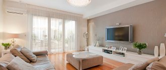
The interior is laconic and simple. Bright colors give energy. White, beige and metallic shades emphasize the depth of the main tone.
Key elements were carefully thought out, this allowed us to achieve a holistic, harmonious look Source casaomnia.it
Cozy combination of dark blue, gray and petrol Source cdn.deringhall.com
How lighting affects color
Cyan has the property of absorbing light. With its use, a room located on the north side can be even more darkened, and a room that is too sunny, on the contrary, can be diluted with freshness and coolness.
The marine shade can distort artificial lighting. So this color is better to choose for well-traveled rooms with large windows. Moreover, using thick curtains and blinds in such a room will be superfluous, replacing them with transparent tulle, which will help fill the room with air.